
Client Work
Design Highlights: Digital · Print · OOH
Designing for Change — The Regenerators


Click the PDF icon to view or download this resource
A selection of design work created to promote short films produced by the Regenerators. For each film, I developed a suite of promotional materials for both online and print, along with supporting resources tailored to their audiences. These included 30+ page community screening kits and school action toolkits, each designed to reflect the themes of the films and mapped to the Australian Secondary Education Curriculum. I was responsible for the art direction across all materials, ensuring consistency and resonance by aligning the design approach with the visual style of each film. I worked closely with the producer at Regen Studios throughout the process to ensure alignment with campaign goals and messaging.


Social assets for the Regenerators. The task was to bring a refreshed look while staying true to their brand-aligned lushness. Over time, I created two separate social brand refreshes to evolve their visual presence while maintaining consistency. The bottom two designs were animated for use as video end frames. I also developed a set of video and static templates for the marketing team — making it easy for non-designers to create consistent, on-brand content.
Logo Design

Simple and elegant logo design
for You & Me Pictures
The brief called for a sense of connection, unity, and collaboration — ideas that are reflected in the two interlinked circles inspired by the infinity symbol. Each circle frames the ‘Y’ and ‘M’ individually, yet together they form one continuous, open unit, visually expressing the strength of partnership and shared vision at the heart of the brand.
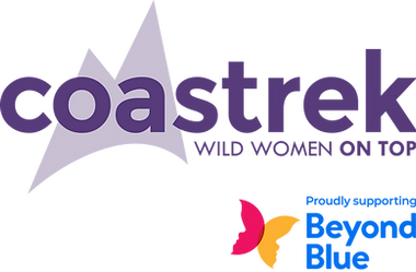
Co-branding logo design
for Wild Women On Top
Part of a broader brand refresh that I led, including the design of the Coastrek brand guidelines. As part of this project, I also designed and developed a suite of social and print templates in Figma, which I then built in Canva for use by non-designers on their team. Available to view or download by clicking the PDF icon.
Designing Emotion: Art Direction for Mental Health Learning


In collaboration with MindSpot’s lead designer, I developed a series of expressive and playful concepts for their course learning videos. The process involved several rounds of exploration, during which we developed and tested a wide range of stylistic concepts focusing on how to visually express emotional states in an accessible way. The use of shape, line, and colour aimed to create a visual language with universal resonance—one that could communicate emotions and mental states across diverse audiences without relying on having multiple representative figures. This approach was designed to keep the focus on the content, while enhancing emotional depth through intentional use of visual language and animation. The designs were grounded in MindSpot’s primary and secondary colour palette and closely followed my art direction and storyboard sketches. I refined these visuals by reshaping forms, adjusting colour harmonies, and layering subtle noise textures—adding richness and a tactile quality to the visuals. Although the original shape-based characters were eventually removed to better align with the director’s vision (as shown in the final version on my animation page), the core visual language remained. The final animation uses custom brushes to colour within shape outlines frame-by-frame, giving the piece a more handcrafted feel. This project was a valuable learning experience in cross-disciplinary collaboration, adapting to evolving feedback, and balancing creative vision with brand alignment and audience needs.
Art Direction — JNTO Social Branding


Designs for JNTO (Japan National Tourism Organisation). Top row consists of select designed frames from my art direction for a JNTO business pitch that I helped win the account for at the creative agency, Circul8, which ran for the course of 2023. Second row are designed frames for JNTO travel competitions. You can view the animated version on the motion/video page.
OOH Print Collateral — Sanrio x Darling Square Collab


Edited and prepared 22 out of home posters across four formats in InDesign, promoting a three-month event featuring limited-time Sanrio-themed food and drink offerings from various Darling Square venues. My role included design adjustments, image retouching, and preparing final print-ready files—working closely with the producer throughout review and delivery to ensure a smooth, cohesive campaign rollout.
Branded Visuals — Tailored social tiles crafted for diverse brands


During my 3 years at a digital agency, I produced thousands of static assets for social—from posts to stories—across multiple platforms and formats. I regularly created content for multiple brands in a day, balancing brand consistency with creative innovation. By staying on top of trends, adapting to shifting timelines, and keeping files organised and up to date, I consistently delivered high-quality work with care and ensured content stayed fresh and relevant.
Digital Banners — Tahiti Tourism

Designed 200+ web banners in Figma for the Tahiti Tourism 'Treasure Every Moment' campaign—based on approved art direction—across 8 themes, adapted for 6 dimensions and localised into 8 languages. All banners were created development-ready to streamline handoff and implementation.
Icon Design

Colourful IG highlight icons for JNTO AU (Japanese National Tourism Organisation), Entertainment Quarter and Nurses & Midwives Health.
Branded Story Toolkit — Entertainment Quarter
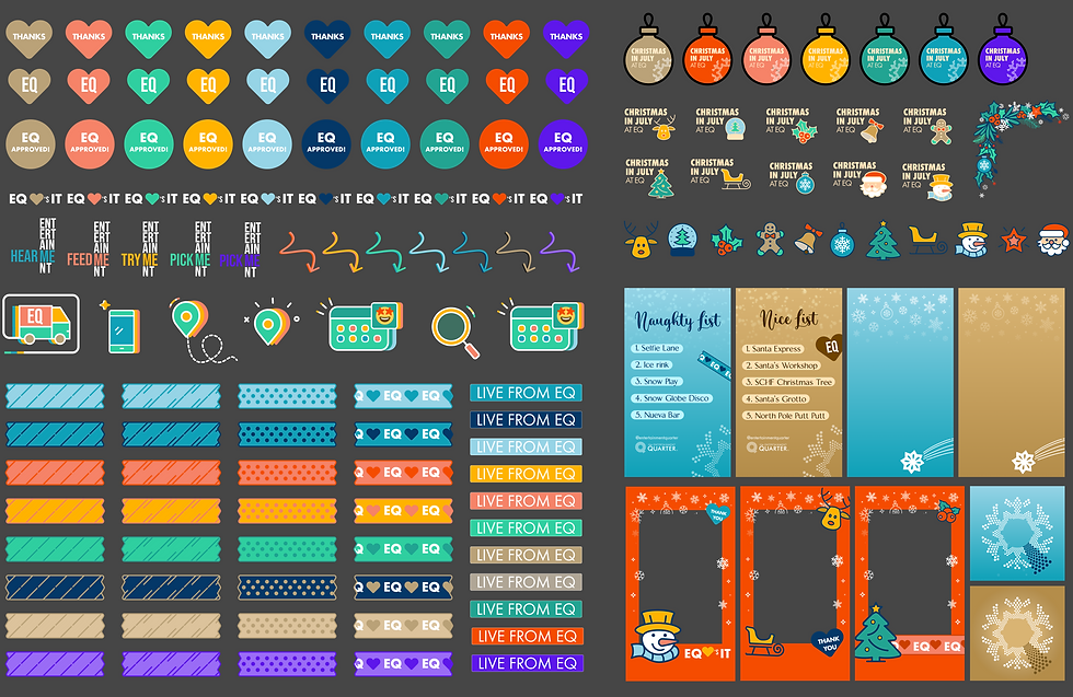
This was a proactive initiative to support the EQ and agency marketing teams by making it easier for non-designers to create on-brand, engaging content quickly and confidently. The suite included editable story designs and a library of custom stickers to add personality and flexibility, all built using EQ’s brand colours to maintain consistency across communications.
Assets covered a range of themes, including a Winter Wonderland Christmas campaign (featuring a custom festive EQ logo), as well as standard designs for everyday use. Additional custom logos and visuals were developed throughout the year for special events.
Additional Print Work & Pitch Design


A collection of design work across print, digital, and out of home formats. Featured projects include an OOH banner for Coastrek, pitch cover designs for CBRE, a print poster for Tahiti Dive, and a digital OOH ad for BarbeCure.
Personal Work
Business Card Design
A personal business card design created in Figma, adapting and integrating my logo and past illustrative work. To evoke a sense of movement and energy, I incorporated a flowing wave element to frame the illustration.


Logo Design


Inspired by the minimal and playful branding of Machi Machi, this project gave form to a concept that had been sitting in my mind for a while — one of those satisfying moments when an idea finally gets to see the light of day. If time allows, I’d love to expand and step up this concept into packaging and menu design to further bring the identity to life.
Letter Set


Adapted the Boba Bud logo designs into a cute, minimalist letter set. Wouldn’t it be nice to have thoughtful, branded stationery available in-store after getting your tea? Personally, I’d love that :)
A Curious Inquiry


An illustrative design series created in Figma, featuring a curious eye as it explores and observes a variety of vibrant, abstract landscapes. The style combines clean geometric forms with organic waves, brought to life through soft, glowing gradients and harmonious color transitions. Using the Noisy Gradients plugin, the work achieves a rich and bright textural quality that blends digital smoothness with tactile interest. The series sits at the intersection of illustration and graphic design, balancing structured composition with visual storytelling.
Typestories

A collection of imaginative and playful title and name designs created in Photoshop for short animated film concepts developed during my studies. Each design blends expressive custom typography with an illustrative flair—tailored to reflect the mood, tone, and personality of each film.


Also included is a custom name design for my former art handle, ‘pokomori’—pairing simplicity with nostalgic charm.
Design Play Series: A Year in Design
Here are a selection of my favourite designs taken from 12 sets of my Design Play ('DesPlay') project in 2022—a playful exploration of design styles that resonated with me, each set shaped by its own distinct theme and explored with a sense of creative freedom. I learned a lot through the process and came away with a stronger sense of the styles I naturally gravitate towards, a sharper eye for applying design principles, and a clearer idea of what I could realistically achieve in a year-long personal project. It was an immersive and fun experience—all created in Figma.


Monochrome Geometric Design Studies


A series of abstract, exploratory compositions using circles and lines that appear to float in space—engaging with the dynamics of spatial relationships, and the interplay between positive and negative space. Rendered in shades of grey, each piece explores tonal contrast and visual balance.
LineScape: A Journey Through My Name
A playful, experimental visual journey inspired by a custom logo of my nickname. The design unfolds across three evolving frames, each acting like a chapter in a colourful, maze-like narrative. The composition is built with a dynamic use of lines, punctuated by occasional circles, semi-circles, and quarter arcs, referencing the original nickname logo in both form and flow.
The structure is reminiscent of a fun, exploratory maze, with each frame introducing subtle shifts in line direction, shape interaction, and color intensity—symbolising creative progression. The shapes dance, stretch, overlap, and reconfigure themselves, turning the nickname into a living visual language.


